library(tidyverse)
incomeSimulated <- read_csv("https://soc114.github.io/data/incomeSimulated.csv")Summary Statistics
Here are slides in web and pdf format. This page is part 2 of the slides.
We often want to take a distribution and convert it to a summary statistic: a one-number parameter that summarizes a fact about the distribution. A summary statistic collapses the entire distribution down to a single number.
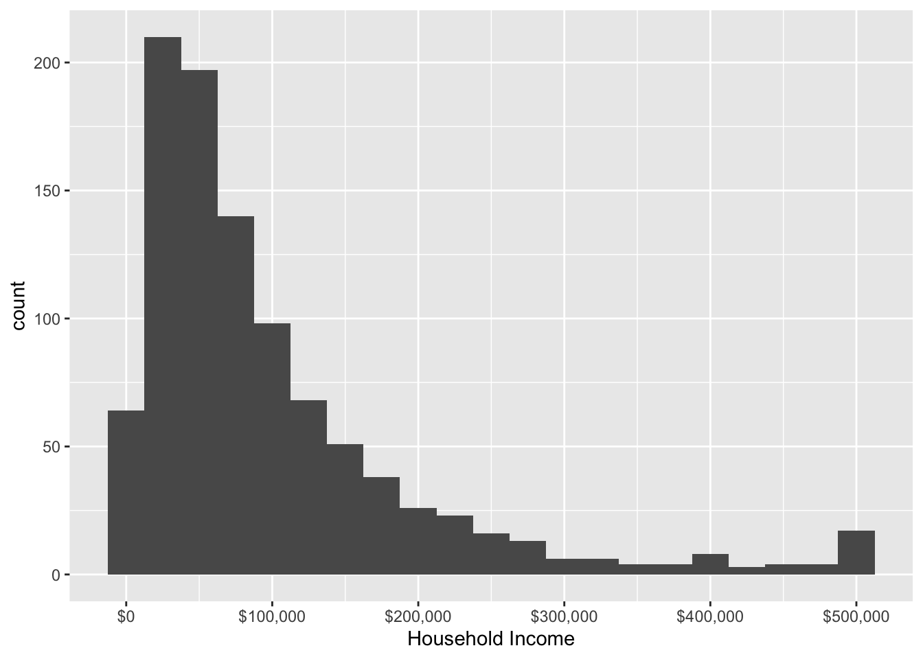
In this example, we will continue with the household income data from the previous page. You can load the data with the code below.
One summary statistic is the median: the value at which 50% of households have higher incomes and 50% of households have lower incomes.

You can produce the median using the simulated data incomeSimulated.csv with the code below.
incomeSimulated |>
  summarize(estimated_median = median(hhincome))
# A tibble: 1 × 1
estimated_median
<dbl>
1 69035.This code starts with the incomeSimulated data and uses the pipe operator |> to pass the data to the summarize() function. The summarize function creates a new variable estimated_median which contains the median value of hhincome, calculated by applying the median() function to this variable. The median() function takes a vector of values and returns a single summary. The summarize() function converts our data that had 1000 rows into a new format that has only 1 row containing the summary statistic.
One can also produce several summary statistics. The median is a useful measure of central tendency: it gives a sense of the income value in the middle of the distribution. But it may not give us a good sense of inequality, which requires some sense of the spread of the distribution. One may therefore want other summary statistics, such as the 90th and 10th percentiles. The 90th percentile is the household income value such that 90% of households have lower incomes. The 10th percentile is the value such that 10% of households have lower incomes.
Below, we produce these summaries in the simulated data. Note that the summarize() function can produce several new variables containing several estimated summary statistics. Here we use the quantile function to produce the percentile estimates.
incomeSimulated |>
  summarize(
    estimated_median = median(x = hhincome),
    estimated_10th_percentile = quantile(x = hhincome, probs = .1),
    estimated_90th_percentile = quantile(x = hhincome, probs = .9)
  )
# A tibble: 1 × 3
estimated_median estimated_10th_percentile estimated_90th_percentile
<dbl> <dbl> <dbl>
1 69035. 17972. 228488.How to choose a summary statistic?
The choice of summary statistic involves a subjective (non-empirical) choice about what aspect of the distribution is important to report. If you are normatively concerned with the growth of high incomes, you might want to summarize the 90th or even 99th percentile of the distribution. If you are concerned with the typical household, you might want to summarize by the median. If you are interested in patterns of inequality among low earners, you might summarize with the 10th percentile.