Visualizing a Distribution
Data science questions often involve many units, each of whom may have a unique value of the outcome variable. How do we summarize all of these outcome values? This page focuses on two approaches: visualizing the distribution and producing one or more summary statistics.
As an example, below we study household income (an outcome) which is defined for each household (a unit of analysis) among all U.S. households in 2022 (a target population).
Visualizing the distribution
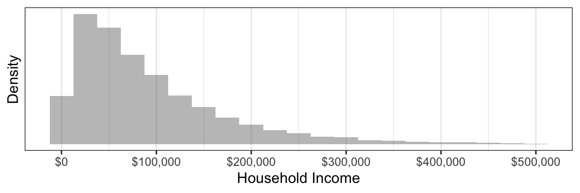
Not all households have the same income: there is a distribution of incomes across households. One way to study a distribution is by visualizing it with a histogram.
To produce this graph, we first downloaded survey data on annual household income from the 2022 Current Population Survey. The histogram categorizes households into discrete income groups that are each $25,000 wide. The height of each bar corresponds to the number of households falling in that income group. We can see that the most common household income values are below $100,000, but a small number of households have very high incomes that create a long upper tail at the right.
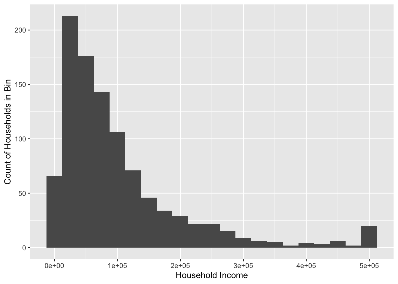
The simulated dataset incomeSimulated.csv available on the course website will enable you to produce a similar graph.
The code below will produce a basic version of this graph. First, you will need to prepare your environment by loading packages.
library(tidyverse) # package with many functions we useThen, you can load the data from the course website.
incomeSimulated <- read_csv("https://soc114.github.io/data/incomeSimulated.csv")The code below produces the graph.
ggplot(
  data = incomeSimulated,
  mapping = aes(x = hhincome)
) +
  geom_histogram(binwidth = 25e3) +
  labs(
    x = "Household Income",
    y = "Count of Households in Bin"
  )
Let’s walk through this code in steps.
- Initialize with the
ggplot()functiondataargument contains the datamappingargument maps data to plot elementsaes()is an aesthetics function that helps
- Add a layer with
+ geom_histogram()layer makes a histogram- Optional argument
binwidthsets the width of each bin
- Optional argument
labs()layer modifies axis labels
For more practice with ggplot, see R4DS Ch 1. A particularly good example you can try is section R4DS 1.2.3.