Visualization
This topic is covered on Jan 14.
Prerequisites. You should first install R, RStudio, and the
tidyversepackage as described in the previous page.
Visualizing data is an essential skill for data science. We will write our first code to visualize how countries’ level of economic output is related to their level of inequality. We will use data reported in tabular form in Jencks 2002 Table 1, made available in digital form in jencks_table1.csv.
A motivating question: Economic output and inequality
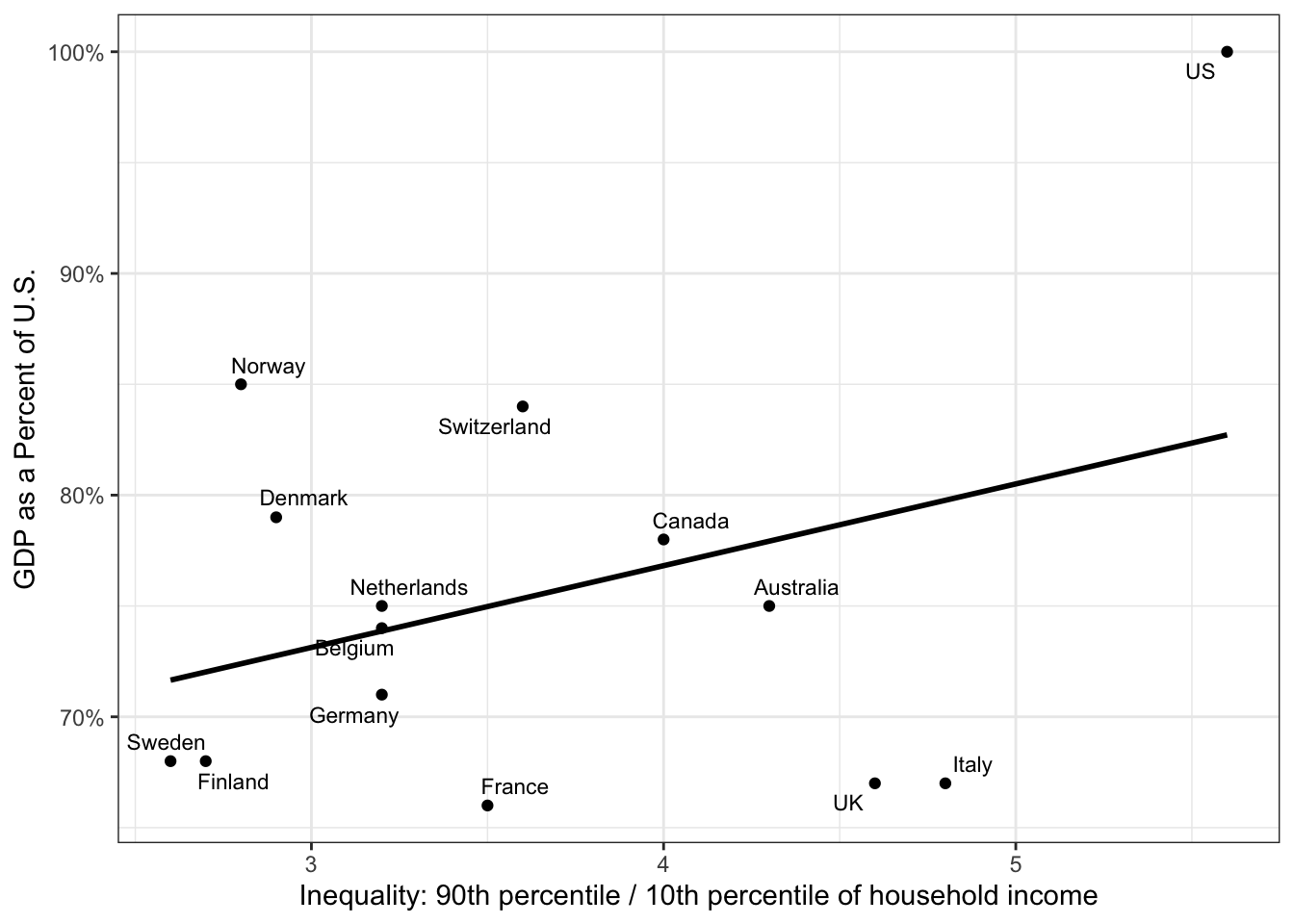
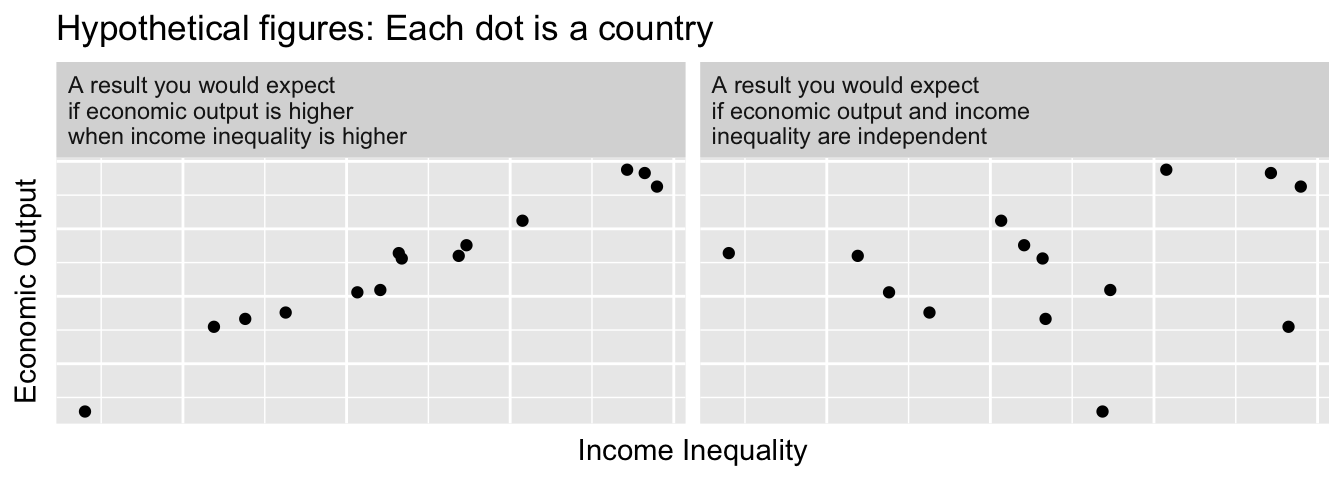
Is economic output higher in countries with higher levels of income inequality? Some argue that this would be the case, for example if high levels of income inequality provide an incentive for hard work and innovation. But is it true?
To begin answering this question, we first have to define measures of economic output (the \(y\)-axis) and inequality (the \(x\)-axis).
Measuring economic output
We use Gross Domestic Product (GDP) Per Capita as a measure of economic output. This measure captures the total economic production of a country divided by the population of the country. For ease of comparison, our data normalizes GDP per capita by dividing by the U.S. GDP per capita. In our data, Sweden’s GDP per capita is recorded as 0.68, indicating that Sweden’s GDP per capita was 68% as high as the U.S. GDP per capita at the time the data were collected.
Measuring inequality
To measure inequality, we consider a measure that asks how many times higher an income at the top of the distribution is compared with an income at the bottom of the distribution. Our measure is called the 90/10 income ratio. We will illustrate this concept using the 2022 U.S. household income distribution, visualized below.
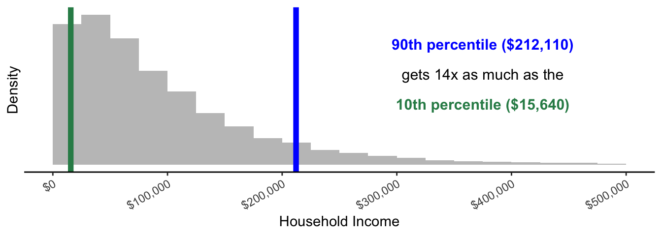
This graph is a histogram. The width of each bar in the histogram is $25k. The height of each bar shows the number of households with incomes falling within the range of household incomes (x-axis) that correspond to the width of the bar.
There are two summary statistics: the 90th percentile in blue and the 10th percentile in green. The 90th percentile is the income value such that 90% of households have incomes that are lower. 90% of the gray mass is to the left of the blue line. The 10th percentile is the income value such that 10% of households have incomes that are lower. We can think of the 90th percentile as a measure of a high income in the distribution and the 10th percentile as a measure of a low income in the distribution.
The 90/10 income ratio is the 90th percentile divided by the 10th percentile. For U.S. household incomes in 2022, this works out as
\[ \text{90/10 ratio} = \frac{\text{90th percentile}}{\text{10th percentile}} = \frac{$212,110}{$15,640} = 13.6 \]
A higher value of the 90/10 ratio corresponds to higher inequality. In our hypothetical case, a household at the 90th percentile has an income that is 13.6 times as high as the income of a household at the 10th percentile.
Prepare the environment
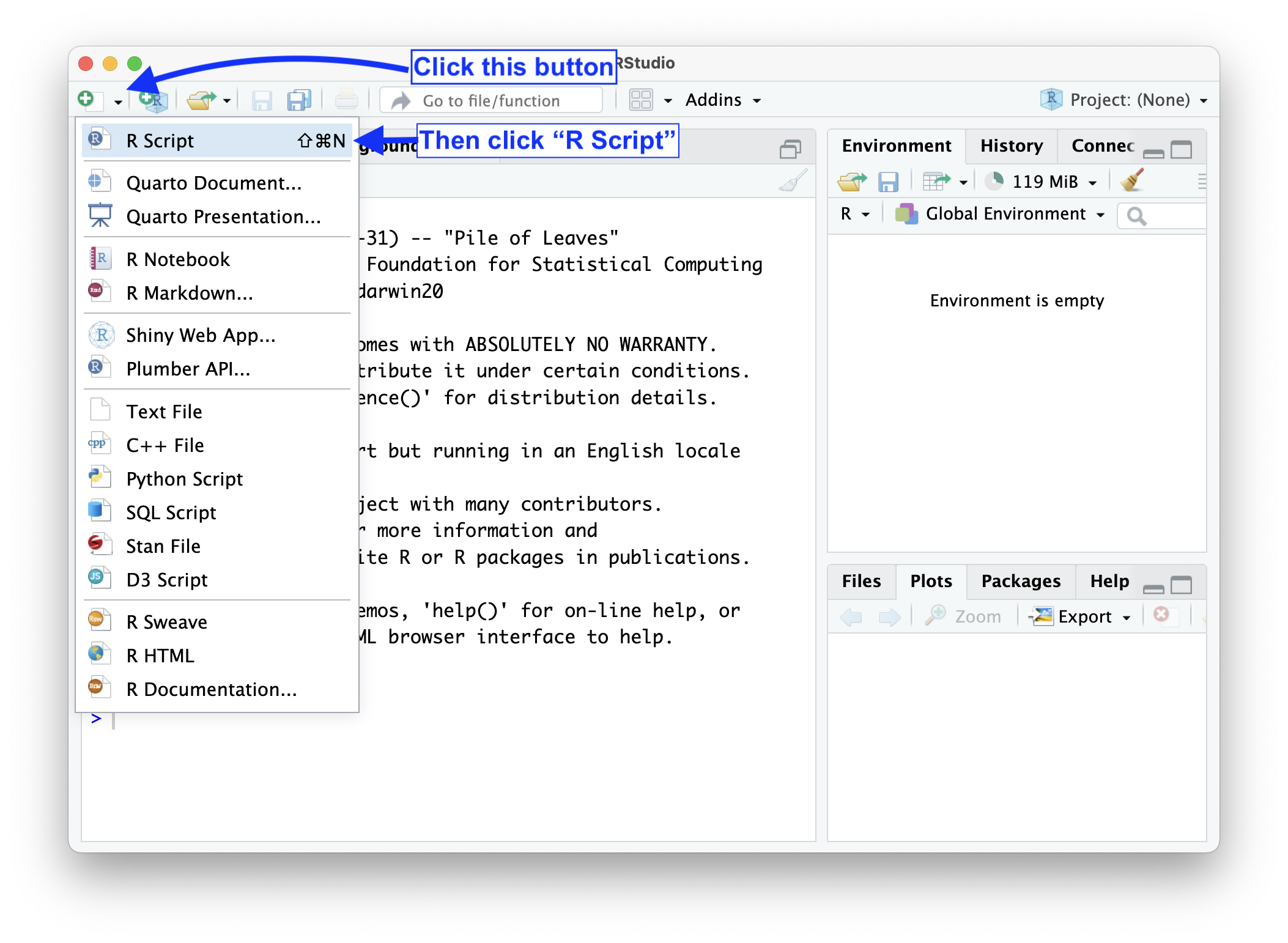
Open a new R Script by clicking the button at the top left of RStudio. Save your R Script in a folder you will use for this exercise by clicking File -> Save from the menu at the very top of your screen.
 Paste the code below into your R Script. Place your cursor within the line and hit
 CMD + Return or CTRL + Enter to run the code and load the tidyverse package.
library(tidyverse)You will see action in the console. You have added some functionality to R for this session!
The data can be loaded from the course website with the line below.
table1 <- read_csv(file = "https://soc114.github.io/data/jencks_table1.csv")When you run this code, the object table1 will appear in your environment pane.
Explore the data
Type table1 in your console. You can see the data!
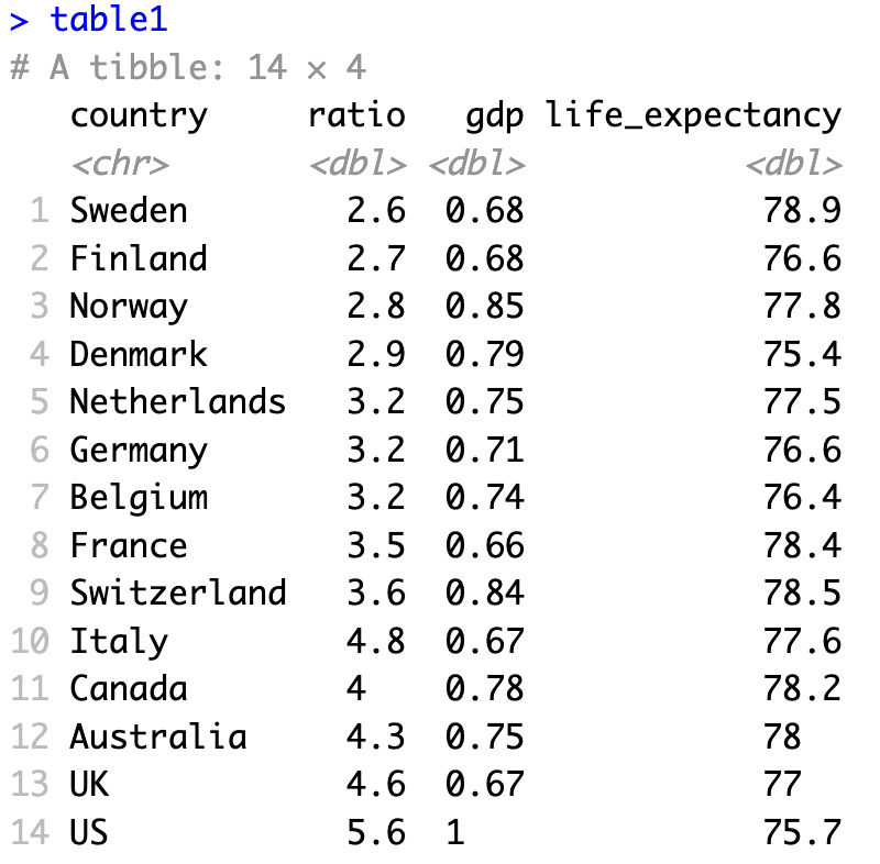
The data contain four variables (columns):
countrycountry nameratioratio is the 90/10 income ratio in the countrygdpis GDP per capita in the country, expressed as a proportion of U.S. GDPlife_expectancylife expectancy at birth
There is one row for each country. For details on the data, see Jencks (2002) Table 1.
Produce a visualization
To visualize data, we will use the ggplot() function which you have already loaded into your R session as part of the tidyverse package.
Begin with an empty graph
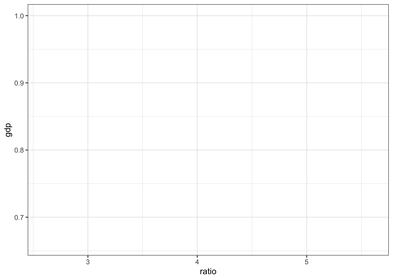
A function in R takes in arguments and returns an object. The arguments are the inputs that we give to the function. The function then returns something back to us.
The ggplot() function takes two arguments:
data = table1says that data will come from the objecttable1mapping = aes(x = ratio, y = gdp)maps the data to the aesthetics of the graph. This line says that theratiovariable will be placed on the \(x\)-axis and thegdpvariable will be on the \(y\)-axis.
When you run this code, the function returns an object which is the resulting plot. The plot will appear in the Plots pane in RStudio.
ggplot(
  data = table1,
  mapping = aes(x = ratio, y = gdp)
)
Add a layer to the graph
Once we have an empty graph, we can add elements to the graph in layers. ggplot() is set up to add layers connected by a + symbol between lines. For example, we can add points to the graph by adding the layer geom_point().
ggplot(
  data = table1,
  mapping = aes(x = ratio, y = gdp)
) +
  geom_point()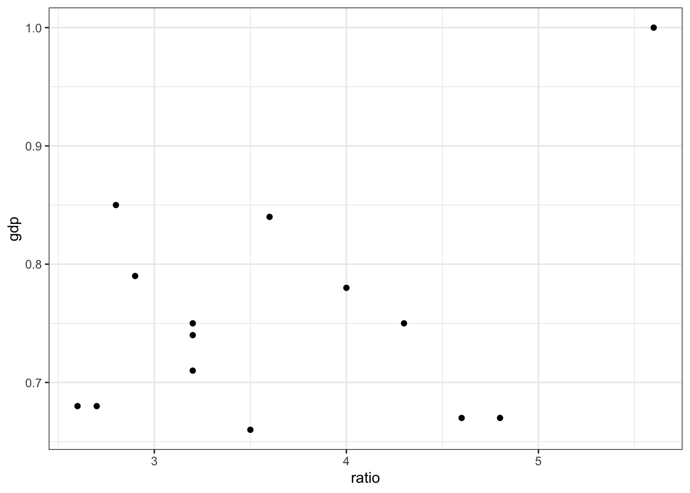
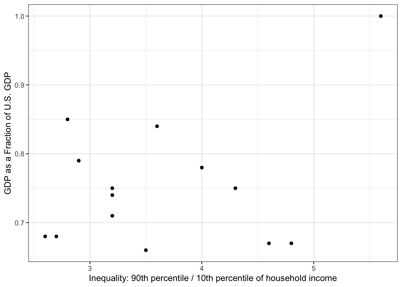
Improve labels
ggplot(
  data = table1,
  mapping = aes(x = ratio, y = gdp)
) +
  geom_point() +
  labs(
    x = "Inequality: 90th percentile / 10th percentile of household income",
    y = "GDP as a Fraction of U.S. GDP"
  )
Customize in many ways
There are many ways to customize the graph. For example, the code below
- loads the
ggrepelpackage in order to add country labels to the points - uses
geom_smoothto add a trend line - uses
scale_y_continuousto convert the \(y\)-axis labels from decimals to percentages
library(ggrepel)
table1 |>
  ggplot(aes(x = ratio, y = gdp)) +
  geom_point() +
  geom_smooth(
    formula = 'y ~ x',
    method = "lm",
    se = F,
    color = "black"
  ) +
  geom_text_repel(
    aes(label = country),
    size = 3
  ) +
  scale_y_continuous(
    labels = scales::label_percent(),
    name = "GDP as a Percent of U.S."
  ) +
  scale_x_continuous(name = "Inequality: 90th percentile / 10th percentile of household income") +
  theme(legend.position = "none")